New Logo, New Location – Same CEDA!

In the past year, there have been many exciting changes at CEDA – as we head into autumn, a traditional time of change and reflection for many, it’s nice to look back at the ways we’ve renewed and refreshed our organization to best meet our community needs for the coming years.
Last November, we launched our new website featuring a vibrant, streamlined look and a redesigned logo. Our new website is easy to navigate and beautifully showcases our programs and stories. We love the energy the comes from all the photos of real students and community members we work with everyday – you can now see highlights from our Instagram feed right on the homepage too.
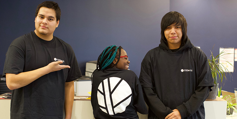
The new website was part of a larger rebranding effort for CEDA that also included a redesign of our logo. Nestled in the top left corner of our website, the logo has the same colours and themes that are used throughout the new site and on all our promotional materials like t-shirts, brochures, posters, and business cards.
We’re so proud of our new logo, and the feedback we’ve had so far about our new look is equally as positive. The logo is youthful and modern, and subtly evokes our old logo, an acknowledgment of our past work in the community and a nice transition to our new brand and the future of CEDA.
Symbolism is important in what we do and to our community, and the logo we chose had to reflect our shared values. The imagery of a feather with a gleam on the side that looks like the moon represents strength and resilience— an important reflection of who we are as an organization and community. Some of the CEDA staff also describe this logo as being circular and beautiful like a medicine wheel, representing community and activism.
This logo was custom created for us by Winnipeg-based Vincent Design, and was first inspired by the spine of a book. It combines a symbol of education with cultural elements in a vibrant and positive way, and we’re already seeing that our students are proud to wear this logo on their new T-shirts. That’s high praise in our books!

We chose to partner with Vincent Design for our rebranding project because they reflect our community development principles, are rooted in the community, and have a portfolio of design projects that impressed us. The whole creative process was enjoyable, and the team at Vincent Design were easy to work with along the way.
The end result is a logo and a website that genuinely reflects what we do everyday – we couldn’t be more pleased.
So while our look might have changed, and we’ve moved to a brand new location to better serve our community, we’re still the same active part of Winnipeg neighbourhoods that we have been for nearly 40 years.
Take some time while you’re here to explore our new site, new look and all the great programs we offer. You can also connect with us on social media from the top right corner of every web page!


